Something for now, but saving it for later.
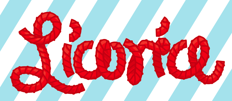
Just like candy
Published March 27, 2011 Art , Design Leave a CommentTags: candy, illustration, illustrator, lettering, licorice, type, typography
Oh Pitiful Shadow…
Published March 2, 2011 Art , Design 2 CommentsTags: anime, fanart, illustration, letter, lettering, type, typography
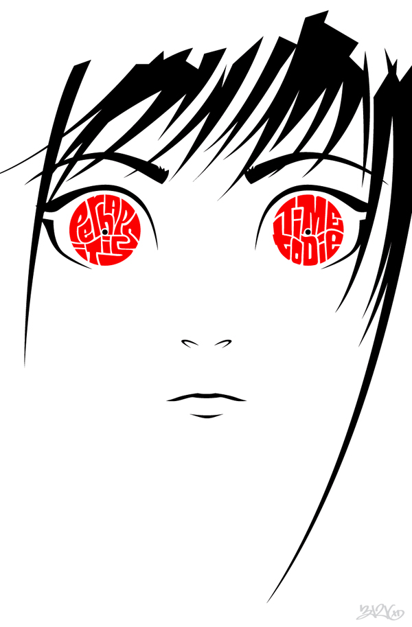
Just a fanart/typography mashup for a series I just finished. She’s Ai from the Hell Girl anime.
MToS: What More Can I Say
Published February 26, 2011 Design Leave a CommentTags: Graffiti, illustration, lettering, music, type, typography, vector
Here is the 2nd installment of the My Type of Song project. It’s from What More Can I Say by Jay-Z (2003).
With all projects, it started with a sketch. Lucky for me I already had some clear ideas, so this process went rather quickly.

Instead of the normal process of scanning and pen-tooling in Illustrator, I went straight to the latter and hoped that I could “wing it”.

I made these blue diagonal lines as a grid to ensure that all my curves and angles were consistent. I ended up changing a few letter forms along the way that weren’t originally sketched out.

I’ve been lousy at tracking hours for personal projects lately, but I think that this was one of my faster start to finish projects. Stay tuned, as I already have installments 3 and 4 sketched out!


This project was originally hatched in August 2010. The original concepts revolved around the types of elevators you see in older buildings, where a gate has to be shut with the old half dials showing the location on the floors. The idea was obviously ‘meh’, as the project sat on the back burner until I recently did the Thank You type. After sketching a few new ideas, I went to work on the next step – composition.

At this stage, I actually tried a new approach – tracing. I traced each piece individually and began assembling the pieces until I was satisfied with the layout (admittedly, this took a few tries to get it right, as I had initially had tried to trace the entire composition before I figured out that if I didn’t like what I had, I had to retrace it again!). From there, I scanned the pieces and again laid them out in Photoshop.

The final step was taking this scan into Illustrator and pen-tooling and nudging to my heart’s content. Once everything was tediously fit together, I clipped the extra lines, joined broken ends, and called it a day.

I did try some things like filling in the strokes, but the added weight changed the overall feel of the piece. Before too long, I hope to do a three color silk screen out of it. Thanks for watching.
E.
The first of a new project titled My Type of Song (MToS). First up to bat, Elevators by Outkast circa 1996. Another post with the process to come…
Thanks… again :)
Published January 13, 2011 Art , Design Leave a CommentTags: lettering, type, typography

I was a little hasty in posting the first version, but now I think I’m really done.

A big thank you to all visitors of my site! With a new year comes a new opportunity to kick start this blog again and post more regularly. Have a great 2011!

As you know, I nerd out with Lego and call it design! Not too long ago I finished making the four characters from this game based off the Wii version (which I can’t get enough of). Click on either the pic to see the entire set (opens in new window).

The initial mock ups always have the most character!
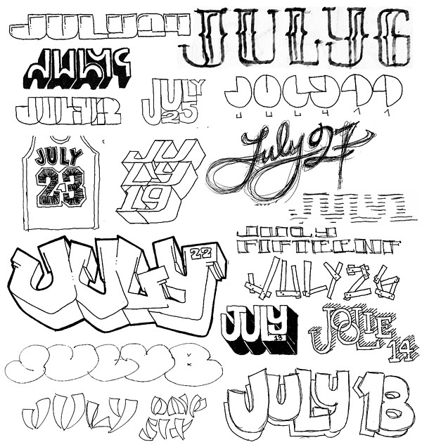
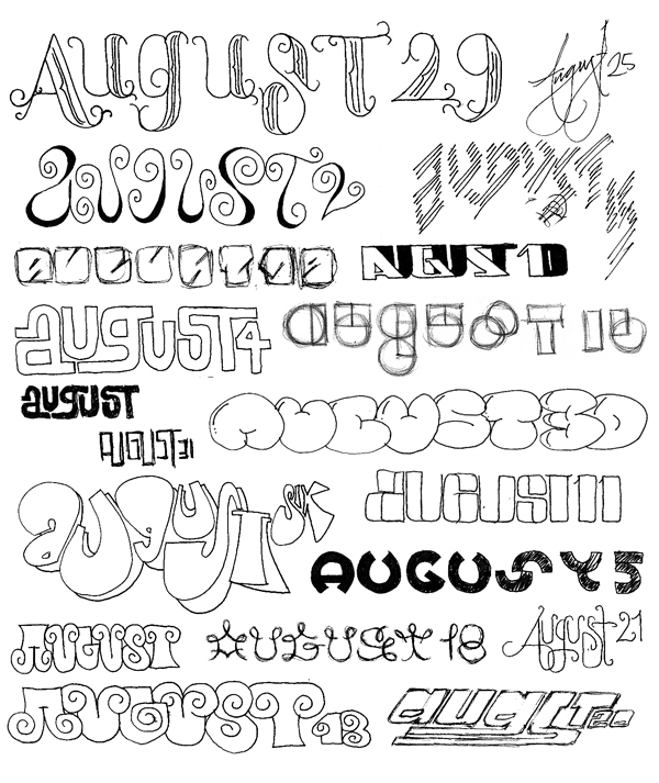
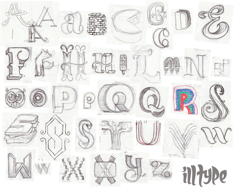
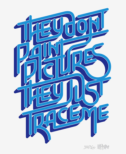
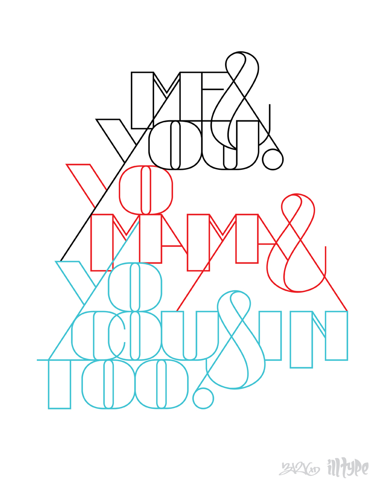
Here are a few things I posted on Illtype from the previous months.